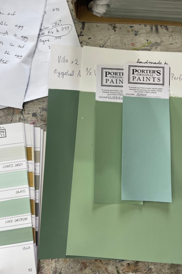
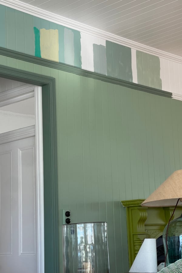
Left: Testing endless green and blue paints. Right: The right combination was so hard to get right.
If you have ever sent me a DM asking what colour green paint is in your sitting room? Or what colour blue is this in your bedroom?
This post is for you!
Below you will find all the colours I’ve used in our home.
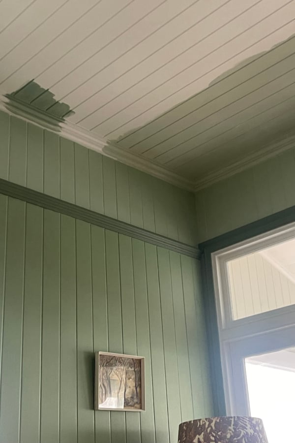
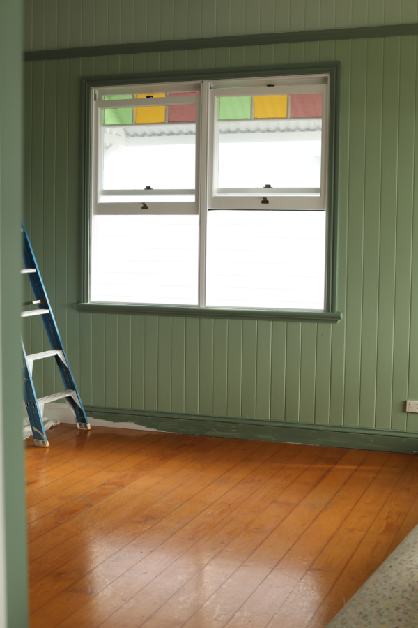
Left: Finding the right colour for the ceiling was actually the hardest of all, light reacts differently on the ceiling. Right: But we got there in the end.
When we moved into our timber cottage two and a half years ago I knew I wanted colour – colour on every wall.
The cottage had been previously painted all white before us, which felt fresh, but we had just spent over a decade living in an all white cottage beforehand and I was craving colour!
And what I soon came to realise while testing colours was that I was craving bold colour!
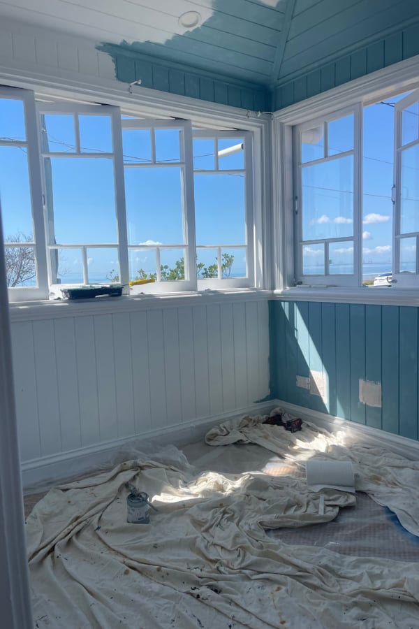
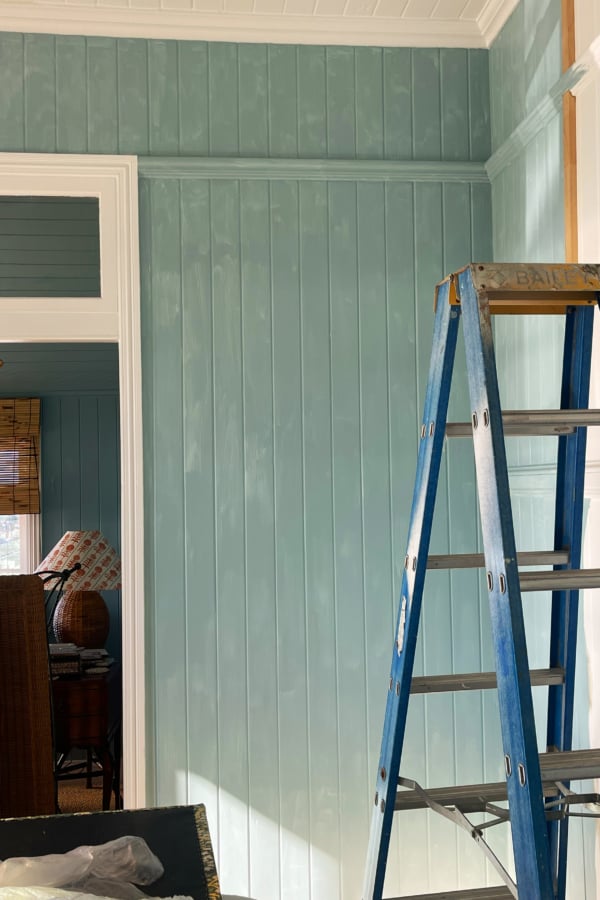
Left: Painting the sunroom really felt like bringing the outside in. Right: Originally I was very nervous about this blue, it felt very bold for me.
My advice to you if you are about to embark on this process is to test your colours in different weather conditions and on different walls – full sun walls and shadowed. Light plays tricks on you and you need to be watching for it.
I live in Queensland, where the sunlight is strong, and our house gets a lot of glare in the mornings. The pastel colours I was dipping my toes in with at the start just weren’t strong enough to hold up in the light.
So I needed to go bolder. And I’m so pleased I did.
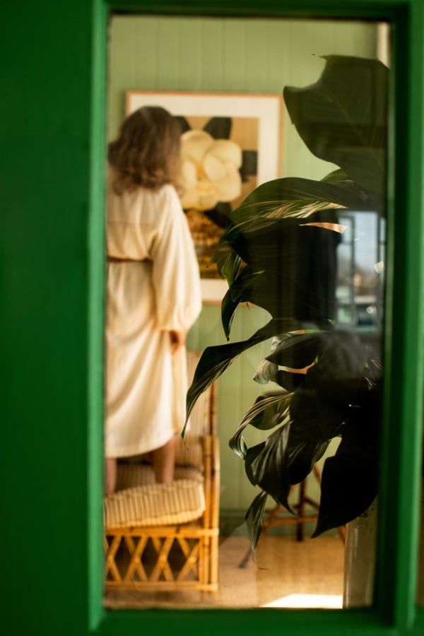
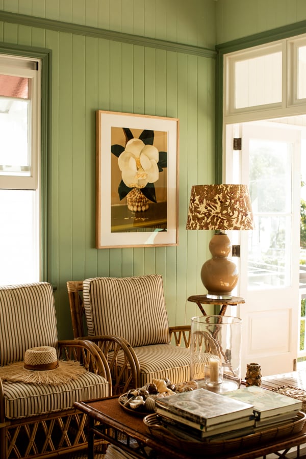
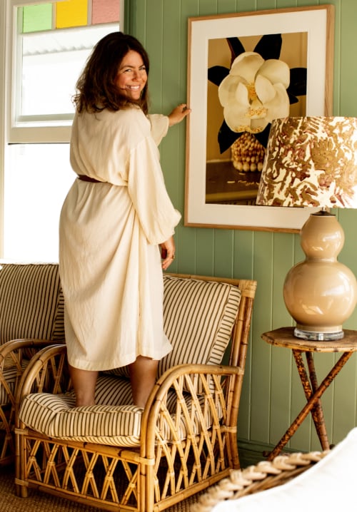
Left: Looking through the front door of the sitting room. Right: Our sitting room with the painting complete and the room really starting to take shape, especially with my Magnificent Magnolia print on the wall.
Fast forward to now and we’ve painted three areas of our house – our main bedroom with sunroom, the sitting room and our children’s room and playroom.
Each one a different colour, and each one bold.
The rooms now feel complete and personal, with wonderful colour and layers of fine art using pieces from my collection.
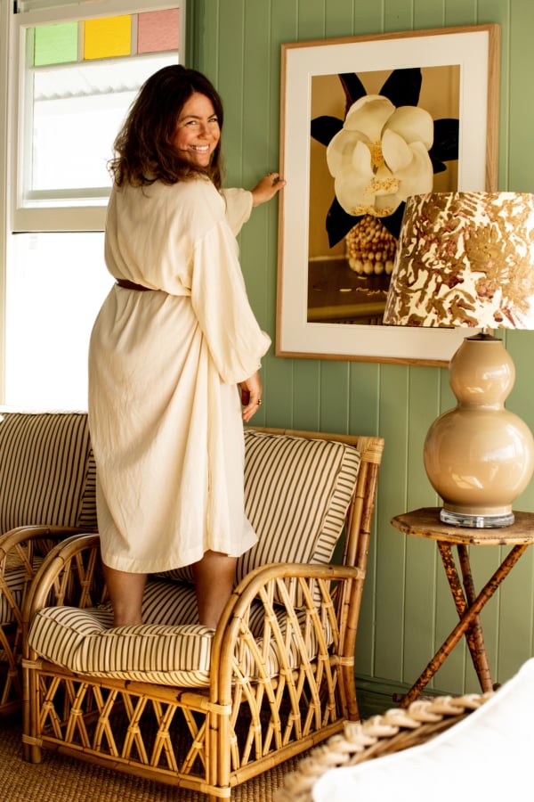
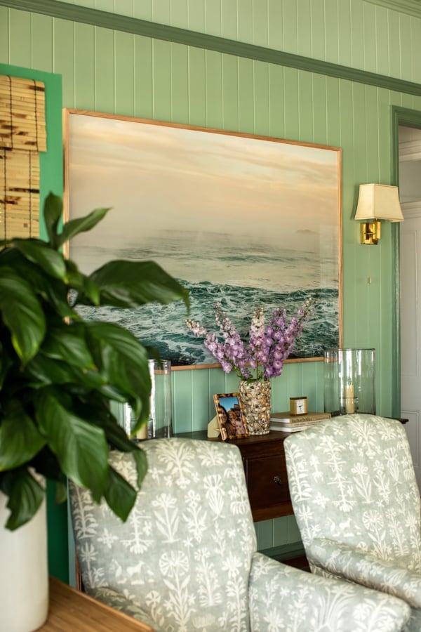
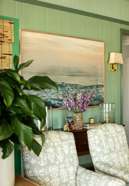
Left: My Magnificent Magnolia print works so well with the scheme. Right: I love coming home each day and walking into this space, it feels so calm. This is my print Dawn in the entrance.
Living Room Paint Colours
I wanted the sitting room and entrance to feel fresh and botanical – like being fully submerged in greens.
All the colours in our home are by Porters Paints
Walls: half strength Winter Green.
Trims: Villa.
Upper wall and ceiling: Glossodia – yes, the ceiling – can’t forget the ceiling when going bold!)
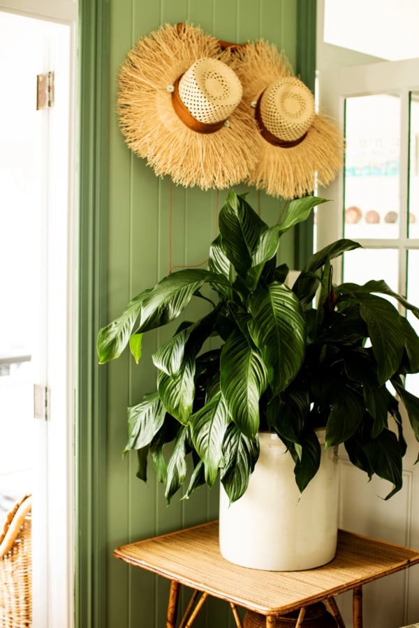
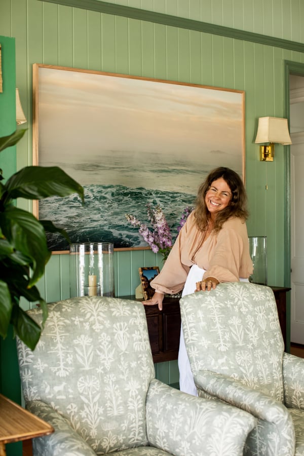
Above: The whole room feels so positive and summery, even in winter.
I love coming home to an entrance that welcomes me with the things I love – where the space feels alive.
Along with all the different green paints, I have my fine art prints Dawn (the extra large size) and Magnificent Magnolia (the medium size) on the walls, and the furniture all work together to make the room feel tranquil.
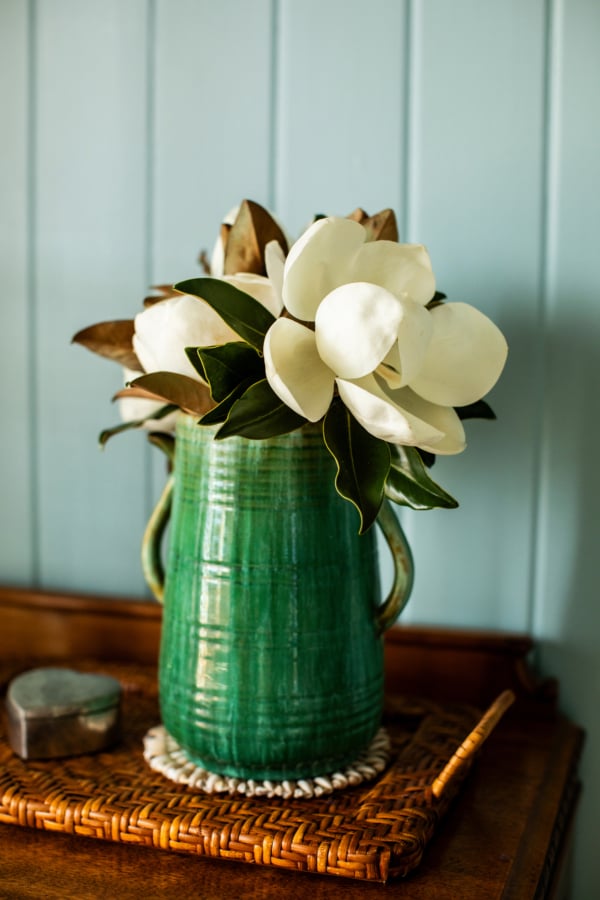
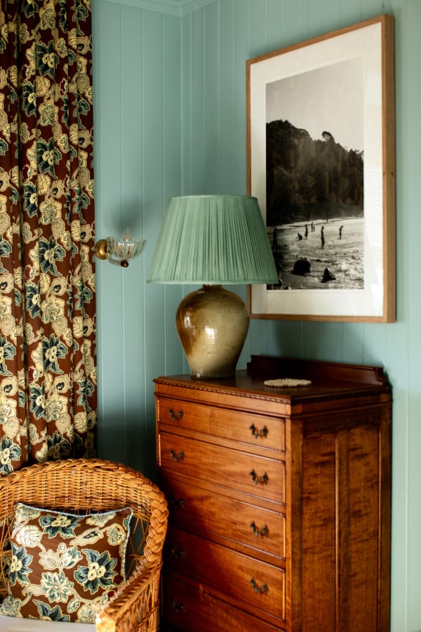
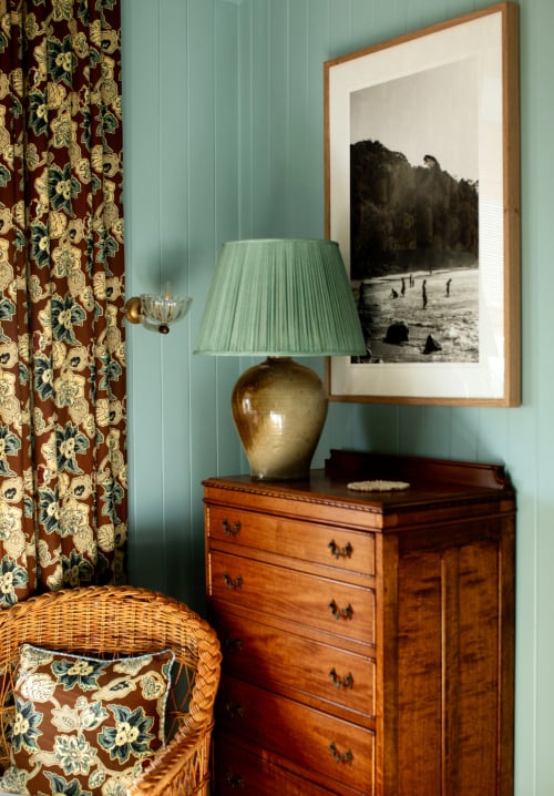
Left: A vignette of magnolias from the garden. Right: This nook in the bedroom is so practical for storage and also looks very charming with Salt Haze over the tall boy.
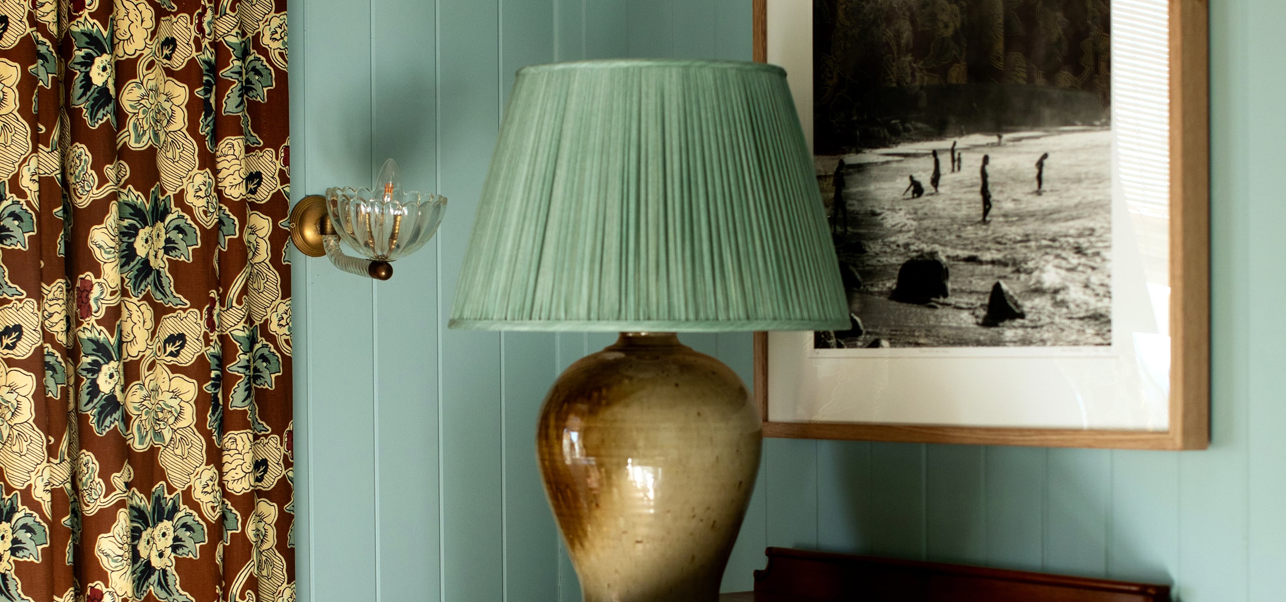
In the bedroom I went for blue – a particular shade I was searching for. A nostalgic seaside blue that was joyful, but not cheerful, with real depth to it.
We painted the small sunroom first, just in case the blue was a mistake.
But as soon as the paint went on, I just didn’t want it to stop – it was the most beautiful shade of blue.
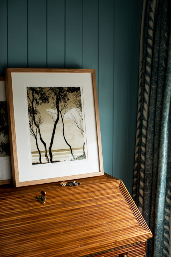
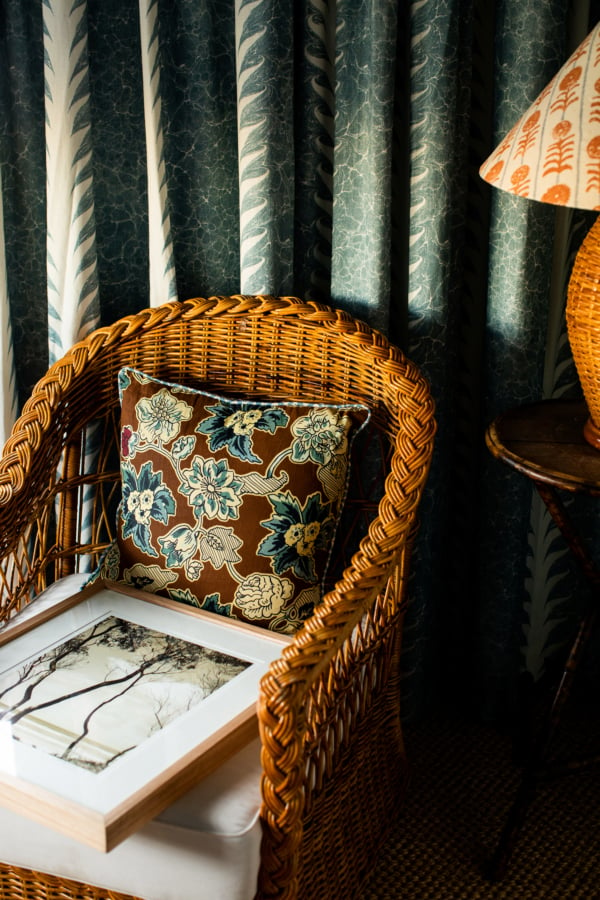
Above: Our sunroom is a small room, but the bold paint make it feel like it has real presence, it’s actually my favourite room of the house. I have my Australian Summer print in the sunroom, on the lean on top of my writing bureau. The perfect little nook.
Bedroom Paint Colour
The room now feels rather mature, which feels grounding.
I especially love lying in bed, glancing over at my Salt Haze print (the medium size) over the antique tall boy and Australian Summer (the small size) in the sunroom, to feel like I’m at the beach whenever I want that calming reset.
Walls: Breakwater
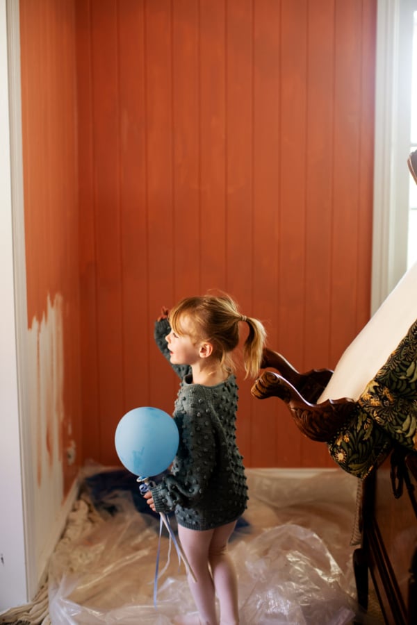
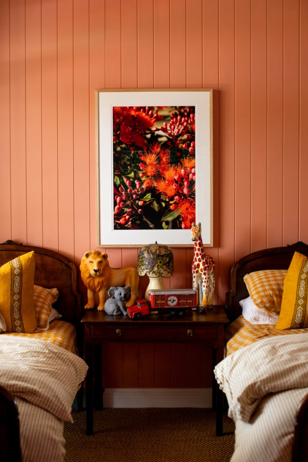
Left: Edie inspecting her room while the paint dries. Right: So happy with how Edie and Alby’s bedroom room turned out – lots of uplifting colour.
Children’s Room Paint Colours
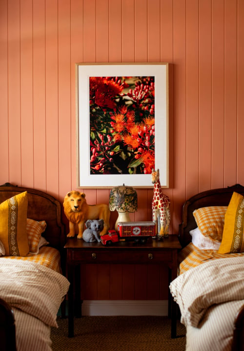
Our children Edie and Alby share a room. I went for pink – which I know says ‘girl’ and I hope our son Alby with forgive me down the track – but to be fair, it’s a dirty pink, a lovely earthy shade.
I wanted their childhood room to be memorable, the kind of room they’ll look back on and remember as enchanting.
I introduced my Gumnut Blossoms print, in the medium size, to the scheme to really add some positive vibrancy.
Walls: Algerian Coral
Trim: Spice Temple
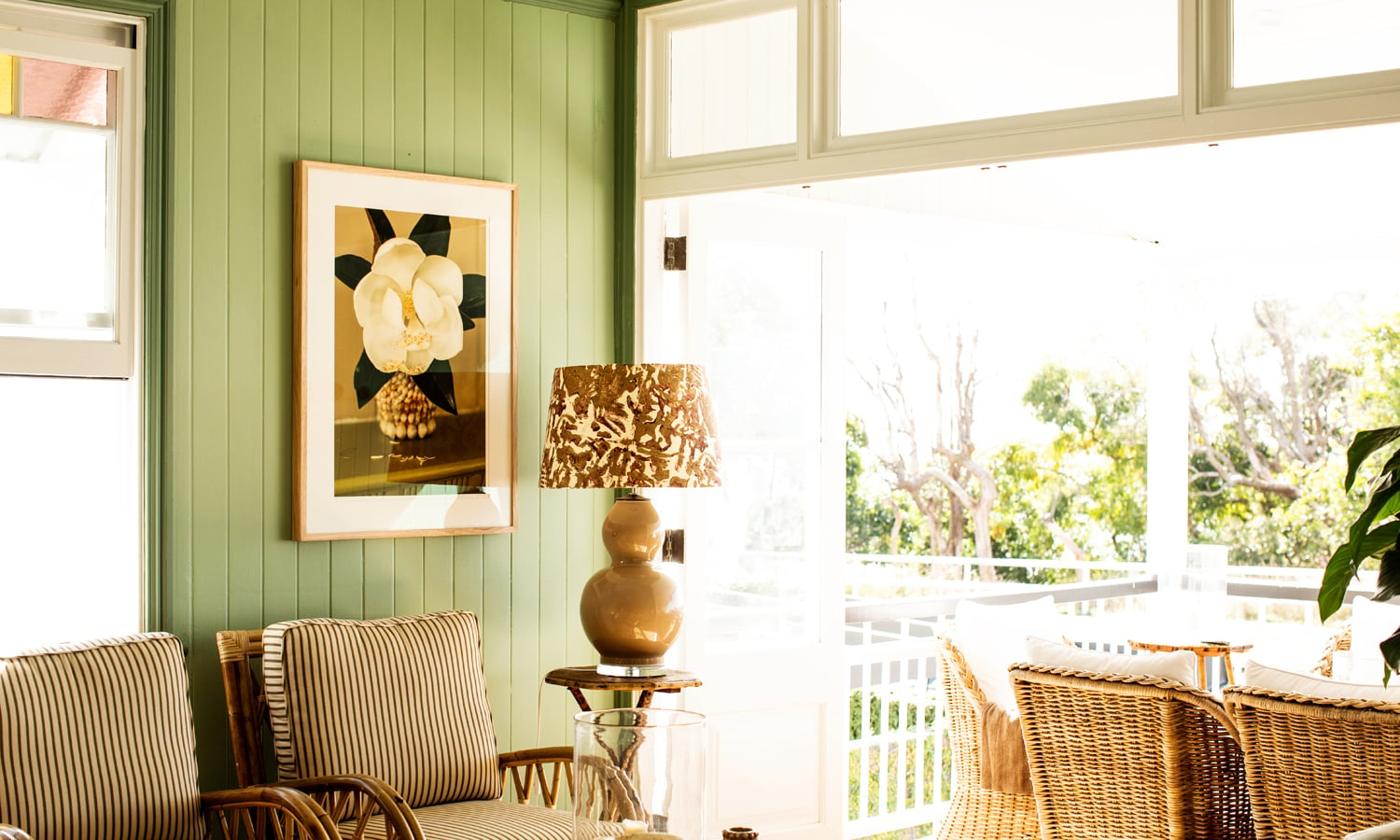
Above: The collection of green paint connects to the outdoors so seamlessly.
My best advice? Don’t rush it. Test your pots, watch how the light moves through your room across the day, and trust the colour that makes you feel something – even if it feels a little scary at first. That’s usually the one you’ll love for years.
And remember, paint sets the mood, but it’s the artwork that finishes the room – if you loved the fine art prints I’ve used in my home – Salt Haze, Dawn and more – you can shop them at kararosenlund.com.
Kara x